Thursday, March 31, 2011

Aliens and High Heels...

Okay, I lied.  I realized I have 4 projects left to show you from last weekend, so I'm going to do two today and two tomorrow.  I know, you're dying of suspense, right?!

This first one is Josh, my hilarious middle child.  That boy has an imagination that spans the universe.  Last summer he informed us that he was actually an alien visitor from another world, and soon nearly everything out of his mouth began with: "Well, on MY planet..."  He is still adding to the list.  I wrote down a whole bunch of things from when he first started saying it, but it disappeared.  Lucky for me, we were staying with my husband's parents at the time and my awesome MIL had also written them down.  Always good to have a backup, people!


I used the Cricut Zooballoo cartridge for the title, George for the star, and Everyday Paper Dolls for the little alien and ship.  I'm 99% sure this paper is from Crate Paper.

The second layout for today features my little cutie Eliza.  She is as girly as they come, so my SIL hit it right on the head when she brought her a little pair of high-heeled dress up shoes on a recent visit.  Her immediate love for them and talent for walking in them just had to be documented!


This paper is from Imaginisce.  I used American Crafts rub-ons for "baby's" and the pink foam stickers for "new."  The white felt letters in "shoes" are from KaiserCraft.  I didn't have any purple Tiny Type letters (and you know how I love those), so I made my own for the remaining words in the title.  The flowers are from Doodlebug.  I cut that scallop square in the background with the Cricut Accent Essentials cartridge.

Okay, so tomorrow will really be the last day of my little posting spree.  See you then!

Wednesday, March 30, 2011

More scrapbooking fun!

Hello again!  I'm excited to show you a few more scrapbook pages from my weekend getaway.  These first two feature my sweetheart oldest kid Sam.


Seriously, don't you just love that smile?!  Oh, these pictures just warm my heart.  The yellow paper is from Cosmo Cricket and the floral is from Basic Grey.  The letters are from the Cricut Jubilee cartridge and the floral accent is from the Gyspy Wanderings cartridge, and of course there are more Tiny Type letters for "this smile."  The ivory string is actually candlewick yarn that I found at the thrift store quite a while ago.


This one makes me happy, too.  I took these photos on his first day of school because I've decided to be a rebel and skip those cheesy school pictures altogether.  These capture his personality so much better!  The stripey paper here is from We R Memory Keepers, but I'm not sure who makes all those cute little accents.  I got them in my goodie bag at the expo and I can't find the package now.  If I find them, I'll update this.  The title letters are cut from the Cricut Stamped cartridge.

One last layout for today!  This one is our family hiking to Timpanogos Cave on Labor Day last year.  I used a Becky Higgins sketch and the title is from the Cricut Jubilee cartridge.  I hand cut the mountain range and the green "vegetation" lines and created the sun with a circle punch and some paper strips.  I haven't been doing a lot of "event" scrapping lately, so it was fun get into that mode again.  This is the kind of layout that I print out copies and put in the family scrapbook for my parents as well.

(Click to enlarge)
That's all for today!  Thanks for stopping by, and check in again tomorrow for the exciting conclusion of my scrapbooking marathon! :)

Tuesday, March 29, 2011

On a roll with scrapbooking!

Twice a year, thanks to my fabulous husband, I get to get out of the house for two days of shopping, relaxation, and most importantly SCRAPBOOKING my some of my best scrapbooking friends.  This past weekend I met up with them at the ScrapbookUSA Expo all day Friday, and then Saturday we set up camp at our local Archivers.  I had such a great time!  I have not done a whole lot of scrapping over the past few months -- mostly cards and other projects -- but the fire has definitely be reignited!  I finished a whole stack of layouts, but I'll just share a couple of them with you today so as not to totally overwhelm.  (I love them all, though, so look for several posts over the next couple of days.)

Here is layout #1:


 I loved this lined from One Fish, Two Fish, Red Fish, Blue Fish (which is a fave at our house) and thought it made the perfect title for these funny face pics of my kids.  The PP, journaling card, ribbon, and trim came from a Fancy Pants kit I bought at the last Expo but hadn't even cracked open yet, so I thought I'd better use it before I could justify buying more goodies... (I know you ladies hear that!)  The letters from "funny things" are from the Cricut Lyrical Letters cartridge, and the "everywhere" is made from Cosmo Cricket Tiny Type stickers.  I just punched and inked circles for the border at the top and to make the title pop, and cut stars from the ribbon to accent that top border.


(Click to view larger)

I really love how this one turned out.  My sister took my kids to a local pizza/arcade place called Pirate Island, and it turned into a marathon of waiting for food and being ignored by servers and such, but they still had fun and she taught them some really good lessons.  When I was planning this layout I was going to make it all pirate-y and such, but about 3 a.m. the night before the Expo I was lying awake thinking about how that really wouldn't capture the meaning of the experience (I know, I'm a nerd).  I remembered this kit that I bought from Memory Works at the Expo about 4 years ago (anyone noticing a theme?) that had these cute little clock overlays and I was really hoping it would work.  (You know, instead of being one of those ideas that sound perfect when you're half-asleep but are completely ridiculous once you're fully conscious.)  Not only did the clocks work, but the colors of the kit and all the little elements were perfect.  Yes!  Oh, and I'm not sure if you can tell from the scan, but I also sprayed the area where the two sets of pictures meet (like under the top of the journaling up to under "Life") with "Old Lace" glimmer mist, just to give it a little somethin'.

For this one, I believe all the elements are from a company called "GenX," but I'm not sure.  It's a really old kit... Oh, and there are more Tiny Type letters from Cosmo Cricket in red.  Those are just the coolest ever.

Thanks for stopping by!  I can't wait to share more with you over the next couple of days!

Thursday, March 24, 2011

Two unrelated cards...

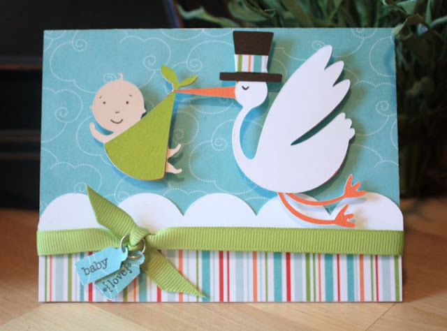
Hey, all!  I have a couple of cute cards to show you today.  This first one was for soon-to-be mom friend's baby shower, and I enjoyed using the New Arrival cartridge for the first time in a long time!  Such cute shapes on that one.  I also used stamps and a punch from Stampin' Up for the little tag.  The paper is from Imaginisce.


The second card requires some explanation.  It was for my dear friend Ramona (who, by the way, is an extremely talented digi-scrap kit designer and owner of Brownie Scraps).  Ramona is a hero to me -- she has 6 smart, funny, talented kids, one of whom has special needs.  She recently wrote an article called "Welcome to Switzerland" about how having a special needs child changed her life, and the challenges that come from it.  The article really touched me -- I recommend it for anyone, whether you have a special needs child or not, because we all have experiences that send our lives in directions we never expected.  Well, then Ramona and her family have just had a string of unbelievable bad luck lately -- everything from a car accident to an awful flooded basement, with lots in between.  I wanted to make her a card to let her know that she was in my prayers and how much I admire her, that also reflected her writings and life philosophy.  Here's what I came up with:


I freehand cut a couple of tall snow-capped mountains, then crinkled them slightly and inked the bumps to make it more mountain-y. I drew a little hiker on her way to the top and added a Swiss flag at the top to tie it in to her article.  For the sentiment, I added a quotation from the leader of our church.  In case you can't read it, it says: "My dear sisters, do not pray for tasks equal to your abilities, but pray for abilities equal to your tasks.  Then the accomplishment of your tasks will be no miracle, but YOU will be the miracle."  It's one of my favorite thoughts, because I truly believe that God can help us do things that seem impossible to us.

Hmmm... I guess these cards aren't completely unrelated after all.  They both have a sky-ish paper background, which I have to admit is a go-to for me.  I actually stockpile papers I think will make a good sky backgroun -- I have at least 5 sheets of each of these.  Are there any particular crafting supplies that you stockpile?

Monday, March 21, 2011

These Boys...


Ah, there's nothing like a couple of pictures you really love to get you in the mood to scrapbook again!  I snapped these shots of my boys over the past couple of weeks, and they just captured the boy's personalities so well I kept coming back to them again and again.

I thought it would be fun to try a new take on the style of the fabulous font on the Cindy Loo cartridge from ScrapbookPal.com.  I have to admit, I wanted this cartridge specifically for the font!  I first fell in love with this style of font when we checked out this book from the library:

Image from Amazon.com
I love the whimsical vintage feel of it, and I tried to recreate it as my title in this layout.  Here's how to do it:

1.  First used the Cricut pens to draw out the solid layer in white and the overlay layer in orange, then cut it out -- this is a super simple way to get a nice outline to the layers.
2.  Adhere the two layers together, offsetting the orange layer slightly down and to the right to give it a 3-D effect.
3.  With a fine-tipped pen, add detail to the white layer as shown.

The font on its own is very feminine, but I think adding touches like this and combining it with a cool doodle-y paper give it a delightful boyish charm.

Thanks for stopping by!

Materials:  Patterned paper, ribbon, trim -- Fancy Pants; Acrylic heart and star -- Heidi Swapp; Die cuts -- Zooballoo ("these") and Cindy Loo ("BOYS"); Buttons and acrylic arrow -- unknown

Wednesday, March 16, 2011

A little way to help...

We have all been saddened by the horrific scenes in Japan since the earthquake and tsunami and the ongoing problems from them, and I know I have been touched by the many, many ways in which people are reaching out to help.

The amazing Cheri from I am Momma, Hear Me Roar has come up with her own brilliant plan to motivate us all to donate by sharing a really beautiful pattern for a new bag for anyone who makes a humanitarian donation of at least $8.  You can read all the details here

I know that there is so little that I can do in the face of so much suffering, but I also truly believe that even my little contribution will alleviate the suffering of at least one person in some way.

"If ye have done it unto one of the least of these, my brethren, ye have done it unto me."  -- Matthew 25:40 (emphasis added)


Tuesday, March 8, 2011

If you subscribe via email...

I've just switched my email subscriptions from Feedblitz to Feedburner, which my rockstar blogger brother assures me will make all our lives easier. :)  If you'd like to receive updates when I post through your email, would you please take a moment to sign up (or re-sign up) using the link on the left?  Thanks so much!

Sunday, March 6, 2011

Pretty cards for Spring! -- ScrapbookPal.com

Raise your hand if you're ready for Spring!  Can I get a hallelujah?!  I am sooooo done with winter and I'm ready for some sunshine and flowers!  But it's still gray and yucky around here, so I decided to create a little springtime of my own with the Cindy Loo cartridge and TomBow watercolor markers from ScrapbookPal.com. :)

I decided to make two different cards with similar cuts, one whimsical and bright and one a little more sophisticated, just to show the great flexibility of the artwork on this cartridge. 

First, the cute, whimsical card:


For this card, I cut the shape at 5" and mounted it on the left-hand side of the card, trimming off the excess.  Then I mounted what I had trimmed off on the right-hand side.  I used my turquoise and pink Tombow markers to accent the little birdie part of the cut, using the blender pen to pull some of the turquoise in from the edge to create some shading.  I added some little pink punched flowers and added pearls to the centers.  I also added a sentiment using the markers and Stampin Up stamps and punches, adhering ribbon to the back to "hang" the sentiment flower.

Now, for a more sophisticated twist on the same idea...


I cut at 5" and mounted it on a grey card base, then added the "thank you," which is one of the phrases on the font layer.  I also added a few rolled spiral flowers and a cute little butterfly.  I just love this grey, white, and mustard yellow color combo right now!  Such a great sunny pop of color, don't you think?

I do hope spring is on its way, but until the sun is here to stay, cheer yourself up with some pretty flowery cards! :)

Thursday, March 3, 2011

Granola Goodness

I really really love things that are crunchy (just ask anyone who's been in the same room with me and a bowl of goldfish crackers). Add sweet and nutty and slightly salty to the mix, and I am in heaven. My sweet friend Shanda invited me over to her house for a remedial bread-making lesson and also let me try her homemade granola, and I could feel the swellings of a new obsession taking shape. As soon as I could gather the ingredients, I made a batch of my own, and my life has never been the same. I could eat this three meals a day plus on top of ice cream for dessert. Not that I've done that...


It's a good thing it's chock full of good-for-you, because otherwise I could never justify the crazy amount of it I've eaten over the past two weeks.

Here is my version of her recipe -- I added a few things that I really love:

Granola

¾ c. pure maple syrup
½ c. coconut oil
¼ c. honey
2 T. molasses
2 t. vanilla extract
2 t. cinnamon
½ t. salt

8 c. rolled oats
1 c. sliced almonds
1 c. shredded coconut (unsweetened, but if you only have sweetened on hand it turns out fine)
1 ½ c. seeds – I mix sunflower, pumpkin, flax, and sesame seeds
½ c. chopped dates

Preheat oven to 300º F. Line cookies sheets with foil (I use three cookies sheets to get enough surface area).

Mix wet ingredients in large bowl. Add dry ingredients and toss until evenly combined. Spread on cookie sheets to ¼” – ½” thick. Bake 45 min. total, flipping granola every 15 minutes until golden brown. Do not allow to overbrown.

Try not to eat it all before the kids get home from school…

Tuesday, March 1, 2011

My happy kitchen :)

A few months ago I posted here about some makeovers I had been doing around the house in an effort to get it spiffied up to sell.  I showed you how I transformed our kitchen from this:

Snoozeville, right?  To this:


SO much better!  I love how bright and happy it turned out.  I promised then that I would do another post about the decorations above my cabinets, so I when I saw the kitchen linky party over at Love Stitched I thought now would be a good time to actually do it!

I tried a bunch of different things before I did all this.  I had live plants up there for a long time -- what a mess!  I tried some pretty grapevine stuff... well, it was pretty in my head.  Then nothing (as in the first pic) for a long time because I just couldn't figure out what to do.  Then at last, I was inspired!

First, some closer-up pics...

Starting from the left, here is what you'll see.  The plates are definitely the big-impact pieces in my kitchen.  I wanted to add plates as bright pops of color, but I did NOT want to pay the $8 and up for the plates in great colors with fun details that I had been finding.  I found these plates at DI (our local thrift store) for 50 cents - $1 each and spray painted them!  I added paper from the Cosmo Cricket "Early Bird" line -- the colors (red, yellow, and turquoise) were perfect for the vision I had in mind.  (Keep scrolling down for a tutorial.)  I've also been working on my old glass jar collection every time I go to DI, and I filled a few with fake fruit and another with styrofoam balls that I covered in strips of the same patterned paper as the plates.  And see that funky pitcher way over on the right?  My brother brought me that guy as a present from Hungary!  Even though he really doesn't match the style of everything else, he's a permanent fixture in my kitchen!


Oh, and I really love this sign above my pantry.  It's from Adorn-It.


This lineup is a mixture of thrifting (canisters), deal shopping ("Blessed" sign for $2.50 at the Scrapbook Expo), As-Is (white enamel pitcher from IKEA for $2), hand-me-downs (that little red baking powder container came from my grandma's house), and one "splurge" -- the awesome turquoise strainer came from a little consignment shop and was a whopping $20.  Don't laugh -- that's the limit of my budget for one piece and I felt totally luxuriant buying it.  :)


Oh, see those glass tiles above?  Those are cheap little frames from IKEA.  They used to be on our living room walls, but I just cut paper to fit and hung them above the stove for a very cheap backspash-ish idea.  I cut the birds out of red vinyl and adhered them to the glass.  I left room for a vinyl phrase in between the rows, but I still haven't hit on quite the right words.

Mostly more plates here, but I also wanted to show you the cool cauldron.  That was a wedding gift from Dan's aunt.  It is really heavy iron.  At Halloween, of course, it takes center stage in the decor, but right now it's the home of the red rooster I bought at TJ Maxx because I have a weakness for polka dots...


**Just a note -- after I took these pictures, I was freaking out a little bit about how white the cabinets were.  But I didn't want to go all crazy with glazing or anything because I wanted to keep it clean.  I took some 60 grit sandpaper and did just a little distressing on all the edges, which helped a little, then I went over everything with a coat of rub-on poly.  Magic!  Just adding that extra layer really toned down the brightness and it looks just like I envisioned now.  Here's a picture -- I couldn't replicate the lighting conditions, so hopefully you can at least get an idea:


Thanks for hanging in there!  Now, a brief tutorial about spray-painting plates so you can create your own custom awesomeness!

1.  Go to the thrift store and dig through stacks of plates.  Don't worry what color they currently are, or what hideous patterns they might be sporting.  You are looking for shape and texture.  I found some with really cute scalloped detailing or pretty flowers or fruit shapes around the borders.
2.  Clean the plates really, really well.
3.  When they're dry, give them a coat of spray primer.  Repeat as necessary to cover aforementioned hideous patterns:

In this picture, all but those awesome sunflower plates are already primered up.  Those babies took several coats to cover. 

4.  When the primer is completely dry, spray paint away!  As always, quick, light coats are the way to go.  But you might be impatient like me and prefer to blast them in heavy coats, in which case you will get some dripping and such, but you won't care because they're going up on top of your cabinets and no one is going to look that close... oops...

5.  Add paper to centers if desired. At this point you could mod-podge over the whole thing to give it a more finished/cohesive look, but I wanted to be able to easily re-paint and change out the paper if I decide to do something different in the kitchen.

So there you have it!  All these little touches make my kitchen happy, and that makes me happy every time I see it. :oD  Thanks for looking!


And no, it's not really that clean 99.9999% of the time...