Saturday, October 30, 2010

Happy Halloween!

I have mentioned before that I am not a big Halloween person, but I thought this year I would put at least a little effort into it. And now I thought I would share my little projects before the big day is past altogether!

A few of my friends and I got together to make these Halloween countdown calendars.  So clever -- it's just a muffin tin, then we cut 3 1/4" squares and put little magnets on the back to cover each cup.  We used our Cricuts and various other goodies to decorate each square, then stocked them with treats from the dollar store or the dollar bin at Target.  My kids LOVED doing this.  I'm excited to make another set of numbers for Christmas, for birthdays, whatever!  I will switch out the ribbon hanger for the various occasions as well.


Here's what it looked like with just the goodies, just to give you an idea of what I put inside.  If things were too big to fit, I just put in a little note.

When I was redoing my kitchen cabinets, I bought a little cabinet door at ReStore to practice on.  I thought it would make a fun door hanger, so I painted it black, distressed it, and added the little witch girl with cream vinyl.  Then I dressed it up with a few ribbon and fabric flowers.  You might notice that beadboard wallpaper is bubbling up a bit.  They are serious when they say let it dry for 24 hours before painting!  Sigh -- I started this project like a month ago and it sat on my craft table forlornly for weeks while I tried to find time to finish.  Got it up just in time!


And here, I'm sorry to say, is my one sad little attempt at decorating in the house.  I painted this witch shoe thing last year, and this year I added the pumpkins.  They came from the dollar store and I spraypainted them white and then with glitter.  I was hoping the glitter would be much more visible, but I think I had the wrong kind of spray glitter for that.  Perhaps next year!  I just added the bottle because I found it in that very cupboard, still wrapped up in the paper it came home from Joann's in.  I'm sure I had an awesome project idea for it at the time...


Anyway, Happy Halloween!  I hope you all have lots of fun and LOTS of chocolate!

Thursday, October 21, 2010

Our Little Getaway...

This past August my dear hubby and I took a little trip all by ourselves to visit friends in Texas.  It was just heavenly, so when ScrapbookPal.com sent me Summer Vacation for this month's project, I knew that this was what I would scrapbook with it.  I love the fun luggage on this cartridge and how it looks all stacked together.  Using my Gypsy, it was very easy to figure out exactly what sizes the different pieces should be.  I also used a tag from Once Upon a Princess for the journaling spot and Stamped for the title.  Stamped was actually the first cartridge I ever bought, but the letters are so skinny and hard to cut that I almost never used it.  But I put this title together on my Gypsy, which allowed me to stretch the letters to a very nice thickness.  LOVE that Gypsy!  How did I ever do without it?  I really like the font like this -- I think I'll be getting a lot more use out of this cartridge now.  I cut the big scallop border with Plantin Schoolbook and the little pink photo corners with Jasmine.

I also used my Antique Linen Distress Ink to add some age to the die cuts, then went around the edges with Blackbird Cat's Eye Chalk Ink to make them stand out even more.

Other materials:  Paper -- Scribble Scrabble; Rhinestone -- Imaginisce i-Rock tool; Small flower punch -- EK Success

Ahhhh, why can't it be vacation all the time? :)  I guess because then the USPS man couldn't bring me my goodies from ScrapbookPal.com!

Thursday, October 14, 2010

Hip hip hooray!

I've been dying to use this new "Togetherness" collection from Cosmo Cricket since I bought it last month, and now I finally had a chance!  I wanted to make a fun, happy card to celebrate my sister's big achievement, and this paper + this week's sketch from 2 Sketches 4 You was just perfect.

Materials:  Paper -- Cosmo Cricket; Die Cuts -- Cricut ("Hooray" from Storybook, birdy from Happily Ever After, label shape from Once Upon a Princess); Border Punch -- Stampin Up; Distressing -- Cat's Eye chalk ink

Thanks for looking!

Tuesday, October 12, 2010

A favor to ask...

Hey, friends -- would you pretty please take a second and help me out? I'd love to be nominated for a guest DT spot for Cosmo Cricket. If you could just go to this link and put "I nominate Tomi Ann Hill" as your comment, I would be so grateful!  I promise to show you all sorts of fun projects if they pick me! :)
 Cosmo Cricket Honorary DT Spot!
Thanks!

Tuesday, October 5, 2010

Life's Ups and Downs -- Summer Vacation


This month ScrapbookPal.com sent me the Cricut Summer Vacation seasonal cartridge.  I've never tried one of these mini-type cartridges before, but this one turned out to have lots and lots of fun shapes to choose from.  I like the graphic style of it and I'm envisioning lots of fun projects I can use it for.  For my first one I chose the classic ferris wheel shape.  It's all one piece on the cartridge, but my 6-year-old had the brilliant idea to make it so it could really turn (and I couldn't say no to that, now could I?).  To make the ferris wheel turn, I just cut out two in the same size -- one in black for the base and one in green for the wheel -- then trimmed away the parts on each layer that I didn't want.  I then used a big brad to go through the hole in the middle so that it really will turn.  Fun stuff!  I do love an interactive card.  :)  ScrapbookPal also sent me a Tim Holtz Distress Ink pad in Old Paper.  I have to admit, I had to do some googling to figure out how to use it.    Man, there are a lot of cool things you can do with these!  I ended up using mine to add some general distressing to my ferris wheel and background papers.  Old Paper is the perfect color for that purpose.  (You can't tell in the picture, unfortunately, but I also sprayed the green layer of the ferris wheel and the bottom patterned paper with Glimmer Mist, just to make it a little snazzier.  Love that stuff!)

Other materials:  Patterned paper -- Scenic Route (top and bottom), Scribble Scrabble (green with little dots); Punch -- Stampin' Up; Brad - Making Memories; Foam Adhesive -- Thermoweb

Wednesday, September 22, 2010

House Before and Afters

We put our house up for sale almost two months ago, and boy, this market is rough!  We don't have a lot of equity, so we decided to make some changes that would be low budget but hopefully high impact.  I thought you might like to see my two biggest projects!

Project #1 -- The Master Bathroom
I really wish I had taken a true before picture, while the walls were still a gross hospital-gown-green color.  I painted that back when we first moved in and hated in ever since, but I was always too lazy to repaint (plus I could never trust myself to pick the right color!).  Before we listed the house I painted it the same tan as our bedroom, but then it was SOOOOO boring.  It actually made our boring ugly we-had-no-money-for-upgrades-when-we-built-this-house cabinets look even worse, probably because now you had nowhere else to look...

Before:


After:


Biggest impact is definitely painting the cabinetry.  It seriously looks like a million bucks compared to what was there before.  I also framed out the mirror, following the tutorial here.  We replaced the ugly mini-blinds with pretty honeycomb shades, and I made super basic toile valances.  My favorite score?  The light fixture was $17.49 at NPS Store, a big overstock/scratch-and-dent warehouse place in Salt Lake City.  The shades were ugly and one of them was broken, so I spent another $12 to replace them with these pretty seeded glass shades.  I even got the lightbulbs at IKEA for 29 cents a box.  Oh, how I love a deal. 

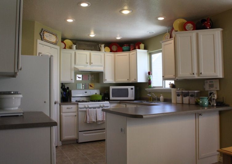
Project #2 -- Repainting the Kitchen Cabinets
I have been wanting to do this for YEARS, but the hubs was not a fan of the idea until he saw the impact in our master bathroom.  Then he realized that yes, I was right and we did, in fact need to transform the ugly cabinets downstairs as well. 

Before:


After:


Since we wanted light cabinets and the walls were white, I first had to repaint our whole main floor.  Let me tell you -- the color "Harmonious Tan" from Behr is decidedly green, but it's a very nice green!  It's what I would have picked as a green had I not been completely scared away from green by my disastrous previous experience (see bathroom history above...).  I then scrubbed up the cupboards really well, gave them a light sanding, and went to town on the refinishing.  I LOVED the look of this kitchen redo, so I followed her instructions for adding the beadboard wallpaper to the insets.  I'm not in love with the color of my cabinets -- I think the "Bleached Linen" (Behr) color I picked is too bright white, but it's definitely a huge improvement over what we had before.  I am in love with the stuff up above my cabinets, but that's another post for another day...

I think these projects make the house look a lot more "custom," so hopefully the buyers out there will realize they are just dying to move right in!

Tuesday, September 21, 2010

Hope Your Birthday is Magical!

I am so in love with the artwork on the Once Upon a Princess cartridge that I received from ScrapbookPal.com!  It's very cute, with just the right amount of spunky-ness to keep it fun and un-cheesy.  I also received great embossing folders that are made to coordinate with the artwork on the cartridge (what a great idea!) and these neat Smooch inks.  They come in what looks like a little nail polish bottle, and they have a fabulous metallic finish that is great for accenting.


For this card I first embossed the background and then sanded it to bring out the details.  I then cut the little fairy at 3 1/4".  These multi-layered cuts definitely take a while to cut and assemble, but they are so adorable it's worth the extra time!  I used the apple green Smooch ink to add the little metallic dots to the edge of her dress and hat, which was such a nice touch.  The little cloud-shaped label and the phrase "Magical" are also from OUaP.  I used my SU scallop border punch to create the grass below.

Here's another sweet little cut from this cartridge.  I cut this angel at 3 1/2" and paired her with a great quote to create a bright, happy card for someone I know who needs a pick-me-up.  I colored her halo with the Olive Green Twist Smooch, which comes out a nice deep silver color.


Thanks for looking!  This cartridge is definitely one of those that gives you a TON of artwork to work with -- between all the cute little dollies, the great icons, the phrases, the labels, and the alphabet, I've barely scratched the surface!